Dear, UXers,
Content teams,
this is for you!

Dear, UXers,
Content teams,
this is for you!

Dear,
UXers, Content teams, this is for you!

Dear,
UX Writers,

Content Designers,

this is for you!

If you're dealing with Content like us,
this probably sounds familiar:

If you're dealing with Content like us, this probably sounds familiar:

If you're dealing with Content like us, this probably sounds familiar:

  • Conflicting copies everywhere

  • Assets all over the place, chaos time baby!

  • Who wrote this copy, why is the tone different here, and for what reason?

  • ​​Not knowing who made the edits, the designer or the developer!

  • Feedback slipping through the cracks

  • Treating content like the icing on a cake

You're not alone - we've been in the same boat for years!

No collaboration between the teams. Adopting an old waterfall process where the projects go from one team to another with little to no communication between them. That always created a lot of confusion, chaos, and misalignments.

Too many places to look at with so little context, we felt disconnected, disorganized, and completely lost. The tools that are supposed to help us are actually making things worse.

Let's look at a typical Product Design Team:

  • The UX do the wireframes/ prototypes

  • The Content Team writes the copy

  • The Designers do the UI

  • The Devs do the production

  • The Product Owners focuses on hitting milestones

  • The C level and Marketing in another world

Mash it all together, hoping for the best! 🙏🏻

Mash it all together,

hoping for the best! 🙏🏻

Mash it all together,

hoping for the best! 🙏🏻

Designers copying content from Google Docs and dropping it in the design and hoping they end up unified and fitting the appropriate spaces provided by the UX writers beforehand. Well, good luck with that!

99% of the time, you'll find a bunch of inconsistencies. Thus, it will require a lot of re-writes to match the layout and the intended message. This process is repeatedly happening for every type of project, no matter the team size, nor the design system used. Let's all say it out loud! Our process is completely fucked up!

Designers copying content from Google Docs and dropping it in the design and hoping they end up unified and fitting the appropriate spaces provided by the UX writers beforehand. Well, good luck with that!


99% of the time, you'll find a bunch of inconsistencies. Thus, it will require a lot of re-writes to match the layout and the intended message. This process is repeatedly happening for every type of project, no matter the team size, nor the design system used.


Let's all say it out loud! Our process is completely fucked up!

Designers copying content from Google Docs and dropping it in the design and hoping they end up unified and fitting the appropriate spaces provided by the UX writers beforehand. Well, good luck with that!

99% of the time, you'll find a bunch of inconsistencies. Thus, it will require a lot of re-writes to match the layout and the intended message. This process is repeatedly happening for every type of project, no matter the team size, nor the design system used. Let's all say it out loud! Our process is completely fucked up!

Blend it again

Blend it again

We're not that different; we're all designers!

We're not that different;

we're all designers!

We're not that different;

we're all designers!

​​No one wants to work in silos anymore!
It's inefficient and doesn't produce the best results!

All team members can bring their skills to the table from the beginning:
UX with the experience, and the feeling; Content team with the voice; Designers with the visuals and interactions; and Devs with the functionality.

UX Writers / Content Designers nowadays should be a combination of a copywriter, a content strategist, and have the basic minimum knowledge of UX design.

​​No one wants to work in silos anymore! It's inefficient and doesn't produce the best results!

All team members can bring their skills to the table from the beginning, UX with the experience, and the feeling, Content team with the voice, Designers with the image, and Devs with the functionality.

UX Writers / Content Designers nowadays should be a combination of a copywriter, a content strategist, and have the basic minimum knowledge of UX design.

Chaos

Everywhere

So, is there a way to bridge the gap between Content Strategy and UX Design?

So, is there
a way to bridge the gap between Content Strategy and UX Design?

So, is there
a way to bridge the gap between Content Strategy and UX Design?

Looking for a tool, a platform or a process to bridge the big gap between Content Strategy and UX Design from early ideation to production live websites and apps, was a tedious challenge.

Trying dozens of tools, that either feels clunky, or super duper specialized that covers only a tiny piece of the entire product dev lifecycle. We took the initiative, and oh boy, it was hard to come up with a solid combination that focuses only on leveraging the content strategy value first, as the god father of the web said, a design without content is just decoration.
Content precedes design.

Design in the absence of content

is not design, it's decoration.

Content precedes design.

Design in the absence of content

is not design, it's decoration.

Content precedes design. Design in the absence of content is not design, it's decoration.

Content precedes design. Design in the absence of content

is not design, it's decoration.

Content precedes design. Design in the absence of content

is not design, it's decoration.

Content precedes design. Design in the absence of content

is not design, it's decoration.

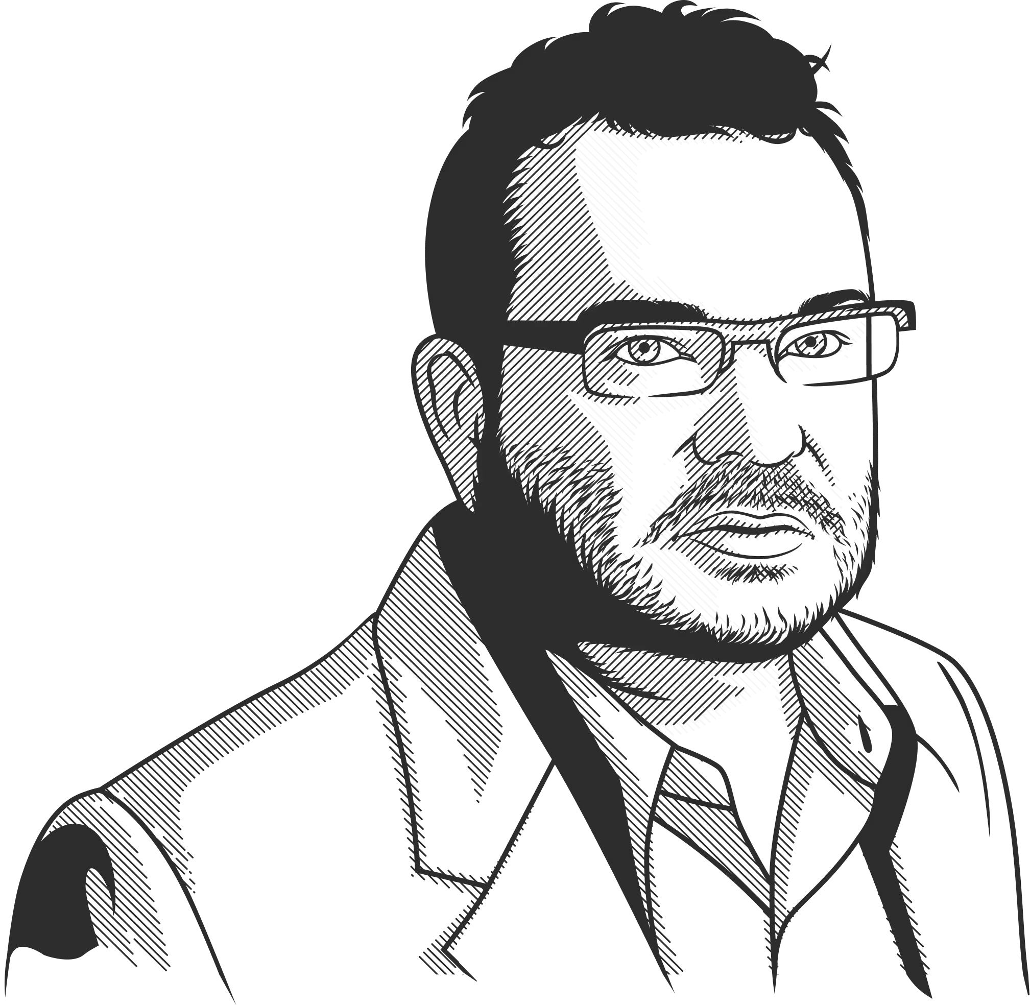
— Jeffrey Zeldman

— Jeffrey Zeldman

— Jeffrey Zeldman

— Jeffrey Zeldman

— Jeffrey Zeldman

So good news, the magic’s still there. It’s just obscured — buried under a mess of bad habits and silo’ed processes. The UX world deserves a dust off. A renovation. Modernized for the way we look at content today. I know, I know, we always say Content is king, but as soon as we start talking pixels, colors, code stacks to name a few, content gets always the back seat.

After a couple years of trial and error, sweat and tears, on behalf of my small team, I’m super proud to introduce you to Punkt.

Punkt is a redo, a rethink, a simplified, potent reintroduction of how we do UX the correct way, putting content in the pilot seat. A fresh start, the way it should be.

So let’s join forces and start designing with content from day one.

So good news, the magic’s still there. It’s just obscured — buried under a mess of bad habits and silo’ed processes. The UX world deserves a dust off. A renovation. Modernized for the way we look at content today. I know, I know, we always say Content is king, but as soon as we start talking pixels, colors, code stacks to name a few, content gets always the back seat.


After a couple years of trial and error, sweat and tears, on behalf of my small team, I’m super proud to introduce you to Punkt.


Punkt is a redo, a rethink, a simplified, potent reintroduction of how we do UX the correct way, putting content in the pilot seat. A fresh start, the way it should be.

So let’s join forces and start designing with content from day one.

So good news, the magic’s still there. It’s just obscured — buried under a mess of bad habits and silo’ed processes. The UX world deserves a dust off. A renovation. Modernized for the way we look at content today. I know, I know, we always say Content is king, but as soon as we start talking pixels, colors, code stacks to name a few, content gets always the back seat. After a couple years of trial and error, sweat and tears, on behalf of my small team, I’m super proud to introduce you to Punkt.


Punkt is a redo, a rethink, a simplified, potent reintroduction of how we do UX the correct way, putting content in the pilot seat. A fresh start, the way it should be.


So let’s join forces and start designing with content from day one.

So good news, the magic’s still there. It’s just obscured — buried under a mess of bad habits and silo’ed processes. The UX world deserves a dust off. A renovation. Modernized for the way we look at content today. I know, I know, we always say Content is king, but as soon as we start talking pixels, colors, code stacks to name a few, content gets always the back seat.


After a couple years of trial and error, sweat and tears, on behalf of my small team, I’m super proud to introduce you to Punkt.


Punkt is a redo, a rethink, a simplified, potent reintroduction of how we do UX the correct way, putting content in the pilot seat. A fresh start, the way it should be.

So let’s join forces and start designing with content from day one.

Introducing

Punkt

Your All-In-One UX Writing & Content Design Platform

As we stand at the precipice of a new digital era, this manifesto sheds light on the profound changes in how we interact, consume, and perceive content. It's not just about aesthetics or functionality anymore; it's about crafting an experience that feels intuitive, meaningful, and, most importantly, human-centric. If you are passionate about the future of design and how we communicate in this digital age, the Punkt Manifesto is essential reading.

Join the movement; let's revolutionize UX together.

The Content First
UX Revolution

The Content First UX Revolution

The Content First UX Revolution

In the intricate dance of design and technology, content has often been the unsung hero, whispered in the shadows, and added as an afterthought. But no more. Punkt emerges from a fundamental belief: Content isn't just a filler, it's the soul. It's time we place content at the forefront, guiding every facet of user experience.

The Age-Old Broken UX model

For ages, the process of creating user experiences was disjointed. Teams moved in silos, with content designers and UX writers scrambling to fit their narrative into predefined designs. This reactive approach resulted in a patchwork of user experience, lacking fluency and authenticity.

The Content First Vision

Punkt's vision is clear and unwavering. The story we tell our users should drive the design, not the other way around. Content shouldn't just fit into design; it should shape it. By harnessing the power of words from the onset, we can craft experiences that resonate deeply, communicate effectively, and engage profoundly.

The Punkt Commitment:

The 5 P's

Pursuit

Pursuit™️

Pursuit

Pursuit

Every journey begins with understanding. By integrating content designers from the early research stages, we ensure the narrative is aligned with user aspirations, needs, and expectations. It's not just about what users want to do, but also what they want to hear.

Plan

Plan™️

Plan

Plan

Content takes the lead. With a clear understanding of the narrative, planning becomes a harmonious collaboration, with content guiding design strategies, influencing layouts, and setting interaction cues.

Prototype

Prototype™️

Prototype

Prototype

An interactive dance between content and design. On the Punkt platform, prototyping becomes a dynamic exchange, with design and content influencing and enriching each other, ensuring a balanced and holistic experience.

Prove

Prove™️

Prove

Prove

Continuous evolution through feedback. Content isn't static. With Punkt, teams can gather insights, iterate, and refine the narrative in tandem with design, ensuring both resonate perfectly with the user’s expectations.

Publish

Publish™️

Publish

Publish

Deliver and evolve. Beyond just shipping the product, Punkt supports the evolution of content and design in response to changing user needs, behaviors, and feedback. This ensures a fresh, relevant, and impactful user experience at all times.

The Punkt Commitment:

The 5 P's

The Rallying Call for Content Designers & UX Writers

Punkt stands as a beacon for:

  • Empowerment: Celebrating the expertise and vision of content designers and UX writers, giving them the tools and prominence they deserve.

  • Collaboration: Fostering a world where walls between content and design dissolve, birthing unified, cohesive, and compelling experiences.

  • Innovation: Championing a dynamic, iterative, and responsive approach to content design, constantly adapting and evolving to meet and exceed user expectations.

We're here to stay

Punkt isn't just a software platform; it's the dawn of a Content First era. It's a clarion call to designers, developers, and content creators to reimagine the way we craft experiences. Let content lead the way, shape the interactions, and drive user engagement.

Join us in pioneering this movement and make the Content First vision a reality for all digital experiences.

We're here to stay

Punkt isn't just a software platform; it's the dawn of a content-first era. It's a clarion call for designers, developers, and content creators to reimagine how we craft experiences. Let content lead the way, shape the interactions, and drive user engagement.

Join us in pioneering this movement and making the Content First vision a reality for all digital experiences

Introducing

Punkt

Your All-In-One UX Writing & Content Design Platform

Introducing

Punkt

Your All-In-One UX Writing & Content Design Platform

Hamza Labrinssi

Co-Founder/ Lead Designer

Don't miss the boat!

A few of our early adopters

Leading international companies have joined our early access program.

A few of our
early adopters

Leading international companies have joined our early access program.

A few of our early adopters

Leading international companies have joined our early access program.

A few of our
early adopters

Leading international companies have joined our early access program.

Made with love in Canada

© 2024 Punkt Software, Inc.